The Keeling Curve

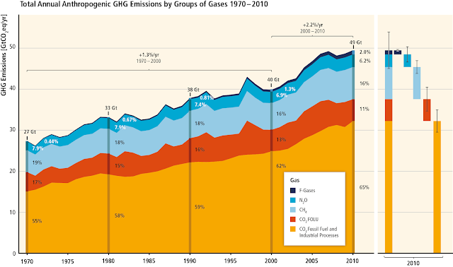
In a previous post , I discussed why most discussions about the climate crisis revolve around CO 2 concentrations in the atmosphere. A short recap: the climate is changing because the concentrations of Green House Gases ( GHG s) in the atmosphere is increasing at a dangerous pace. The top GHG of concern is CO 2 , but there are many other GHGs in focus such as CH 4 (methane) and N 2 O (nitrous oxide). The Keeling Curve shows CO 2 concentrations in the atmosphere. It is maintained by the Scripps Institution of Oceanography at UC San Diego (UCSD). It can be freely accessed here . For example, here is the Keeling Curve for the week ending March 19, 2020. Source Pretty unimpressive, huh? There doesn't seem to much information to be gleaned out of it -- no obvious pattern or events. One thing we can notice is that the y-axis is in units of ppm or parts per million. A concentration of 415 ppm means that there are 415 parts (say, molecules) of CO 2 ...
