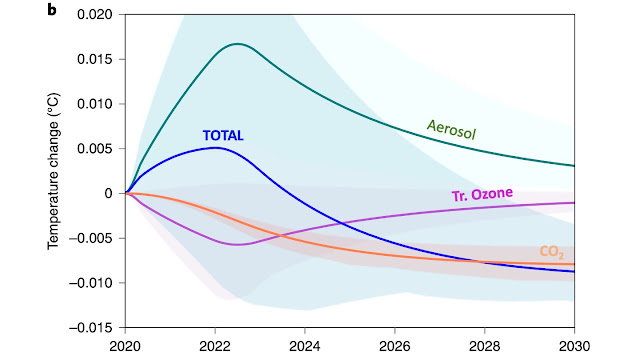
Effects of COVID lockdowns on climate change: figure descriptions

What does this figure mean? Here's a figure I showed in the main blog post . Let's inspect each element of it closely. The x-axis is a time axis showing the decade covered by the simulation. The y-axis shows temperature change in ℃. These results are from the two-year blip pathway compared to the baseline pathway. For the curious reader, the baseline assumes that all countries will meet their Nationally Determined Contributions (NDCs) by 2030. It is a central estimate of emissions i.e. neither the best-case not the worst-case scenario. Now note the evolution of each line on the plot. The aerosols, shown in green, first lead to a temperature increase (because they stop shielding the Earth from the Sun's radiation). In the long term, their effect plateaus out because aerosols have a short residence time in the atmosphere. This means that they can not have any long lasting effects because they get removed from the atmosphere. Next, in pink, is tropospheric ozone. Initially...
