Effects of COVID lockdowns on climate change: figure descriptions
What does this figure mean?

 |
| Source: IPCC AR5 (Figure 7.18) |
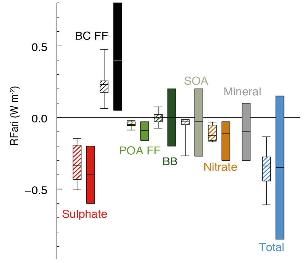
The x-axis shows various aerosols. From left to right: Sulphate (in red), Black Carbon from Fossil Fuel and Biofuel (in black), Primary Organic Aerosol from Fossil Fuel and Biofuel (in green), Biomass Burning aerosols (in dark green), Secondary Organic Aerosols (in olive), Nitrate (in orange), Mineral (in grey) and lastly, there's a Total (in blue). These show the main aerosol types that affect climate.
The y-axis shows something called RFari and its units are in W/m2. What is this?
RF stands for Radiative Forcing and its units are always in W/m2. This is a term you will come across a lot in climate change literature and it is important to get at least a general understanding of it. In very simple terms, it means "contribution towards climate change". For a deeper explanation, go here. When RF is positive, it means that thing or process contributes to trapping energy in the Earth's system - i.e. it contributes to climate change. When RF is negative (see the "Total" in this figure, for example), it means that thing or process does the opposite - and hence reduces climate change.
You may now wonder - what does the "ari" mean in RFari? Aerosols have two main effects on the climate. One is from the aerosol-radiation interactions (ari) and the other is from the aerosol-cloud interactions (aci). In this figure, only the RF resulting from ari have been shown. [It is very, very difficult to calculate RFaci - this is still a challenge in climate science.]
Now let's look at the aerosol type Sulphate, shown in red. There are two bars. This is done to show different estimates and their uncertainties. The left one - a hatched whisker plot - shows modelling results. The right one - the solid bar - shows the best estimate and 90% uncertainty range, according to the IPCC. Let's look at this best estimate. For Sulphate, the RFari turns out to be -0.4 ± 0.2 W/m2. The negative RFari means that sulphate aerosols reduce climate change through their aerosol-radiation interactions (ari).
Compare this with Black Carbon, shown in black. The RFari is 0.4 ± 0.4 W/m2. Clearly, both the estimate and the uncertainty are higher in this case. The positive RFari means that black carbon traps heat and contributes to climate change through its aerosol-radiation interactions.
Finally check out the last bar, the Total, shown in blue. It shows that in total, through their aerosol-radiation interactions, all these aerosol types combine to generally reduce climate change. Good news, eh?
➖➖➖➖➖➖➖➖➖➖➖➖➖➖➖➖➖➖➖➖➖➖➖➖➖➖➖➖➖➖
 |
| Source |
This is a very interesting figure. It shows the effects volcanoes have on global temperatures.
The x-axis is a time axis from 1750-2000. The y-axis shows the average earth land temperature in ℃. The dark black line shows the smoothed values, while yearly temperatures are also shown in fainter black. Several different eruption events are marked in blue. Note how every major eruption has led to downward spike in the global temperature. This is because when volcanoes erupt, they release large amounts of aerosols which shield the Earth from the Sun's radiation. This is the aerosol-radiation interaction we discussed earlier and this also confirms the negative value we saw in the Total in the previous plot.
This figure seems to be from BerkeleyEarth.org but I picked it up from this Mongabay article. It's an amusing article.


Comments
Post a Comment